Let colour lead, your customers will feel it in every bite
Colour cannot be underestimated in gastronomy. It has an impact on people's perceptions – and yours too. Just picture your working environment with little or no colour. Colour affects the appeal of a restaurant, the atmosphere, the entire dining experience. The use of colour can affect the taste experience, and combining contrasting colours can lead to spectacular-looking dishes. With colours, you can keep your guests on the edge of their seats. So, be sure to give your creations more colour! Not only your culinary creations, but also your work in the kitchen and the collaboration with your team: it will absolutely show.
What colour does
This is not an article about how stewed red cabbage can have a healing effect on the mood of the lady of table three. Neither are we going to teach you how to get more tips by using the golden-yellow leaves of Vietnamese water-crowfoot (if that even exist). We will, however, give you an insight into what colour does to people, and therefore to your guests, on all sorts of levels. Because what is colour anyway? What works well on a plate and what doesn't? How can you enhance flavours and (the perception of) temperature through the use of colour? How do your compositions work best and how can colour be a starting point for a new dish?
If you really want to put the focus on the dish and the ingredients, a white plate is always the best choice. Compare it to a white canvas, which also gives a painter complete freedom.
Colour is your brain's interpretation of the signals your eyes transfer when light enters. That's also the reason why you can't see any colours when it's dark. In fact, the rods and cones in our eyes only allow us to perceive red, green and blue light. The other 17 million colours we see are the result of the interaction between your eyes and your brain. Colour provides not only a visual stimulus, but also an emotional experience. It creates a physiological change in your body. Colours affect how we think, how we feel and how we behave. It has even been scientifically proven that not everyone sees exactly the same colours.
Basic emotions
Colours affect how people feel. So that’s something you can use. In marketing, colours are used to develop advertisements and packaging. The use of colour is often based on the basic emotions that colours evoke in people. In the culinary world too, colours have their own effect and origin. Ingredients in the same colour range often have similar effects on your guests. Remarkably, they also often go well together and so you can use them as a starting point for new combinations.
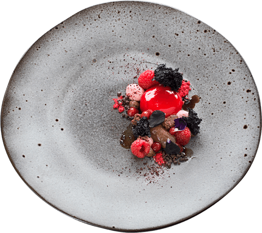
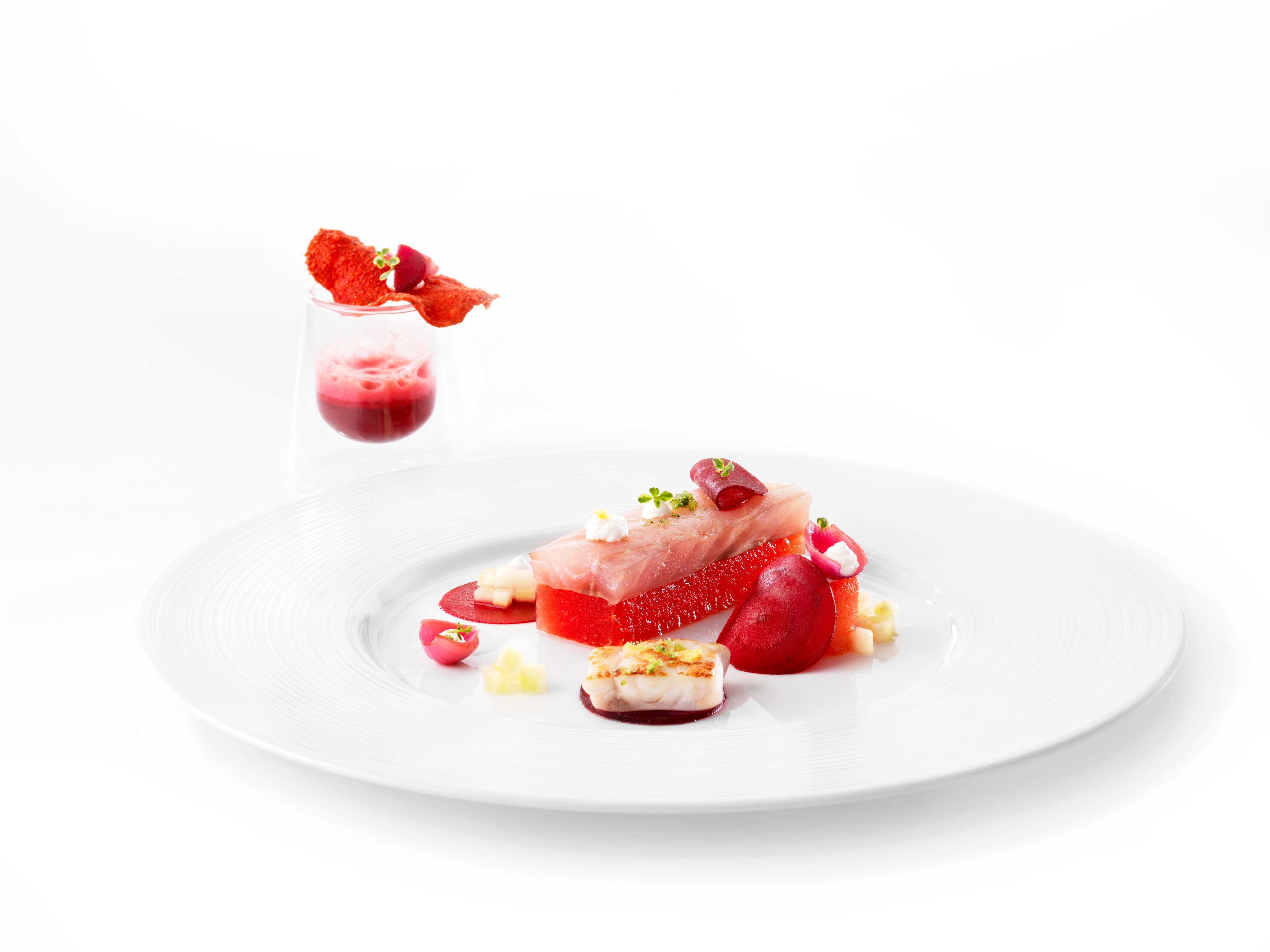
Red: stimulating and activating, provides passion and stimulates appetite, bold flavours. Think tomatoes, peppers, strawberries, red pepper.
Orange: stimulates the brain and appetite, provides warmth, energy and vibrancy. Think carrots, oranges, sweet potatoes.
Yellow: stimulates the brain, thought process and nervous system, provides happiness, freshness and light flavours. Think: lemons, bananas, corn.
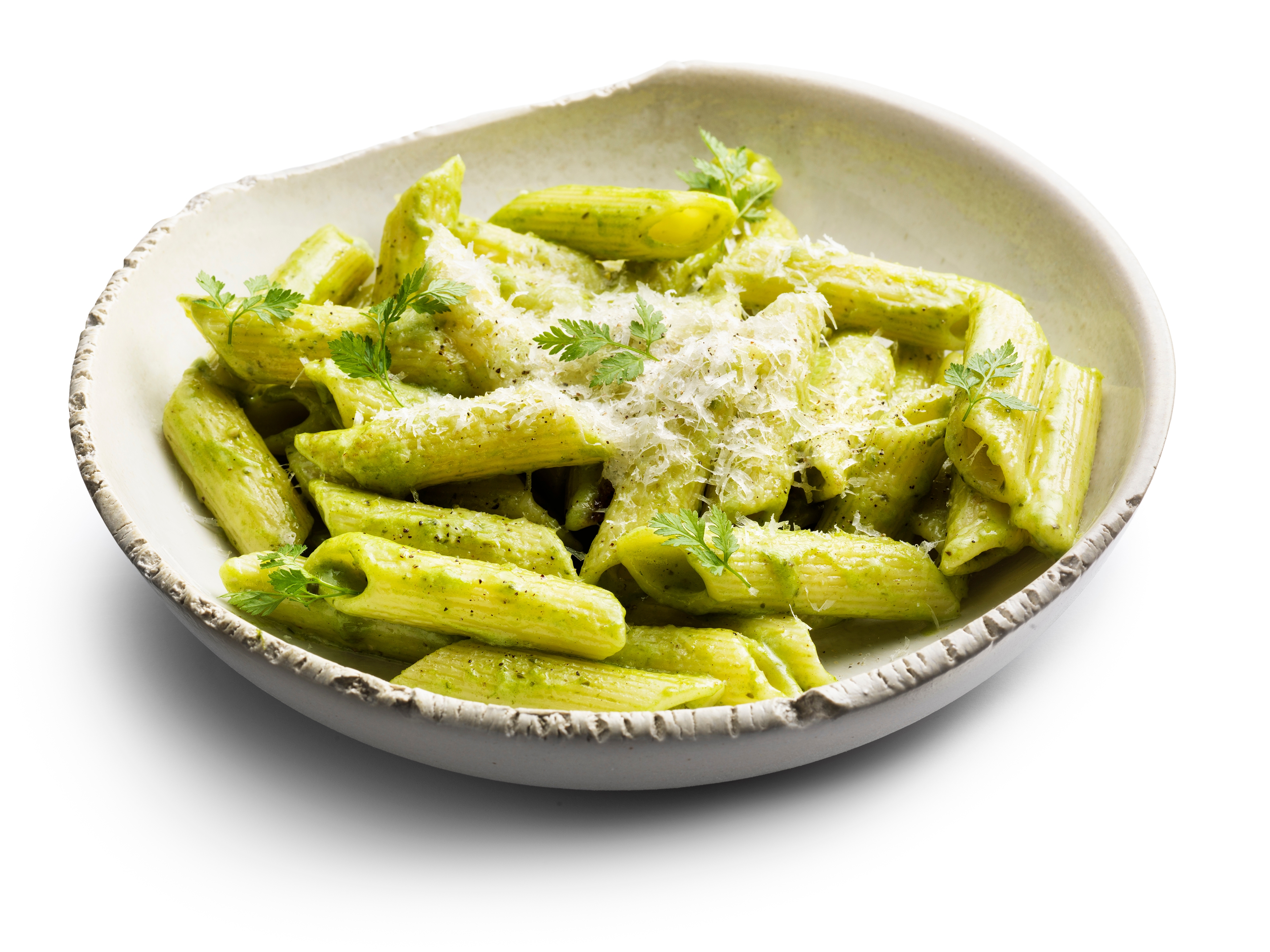
Green: calming and relaxing, ensures health, vitality, freshness. Think leafy vegetables, fresh herbs, courgette, green apples.
Explore Our Colourful recipes
Let your dishes do more, uplift your customers with every colorful recipe.


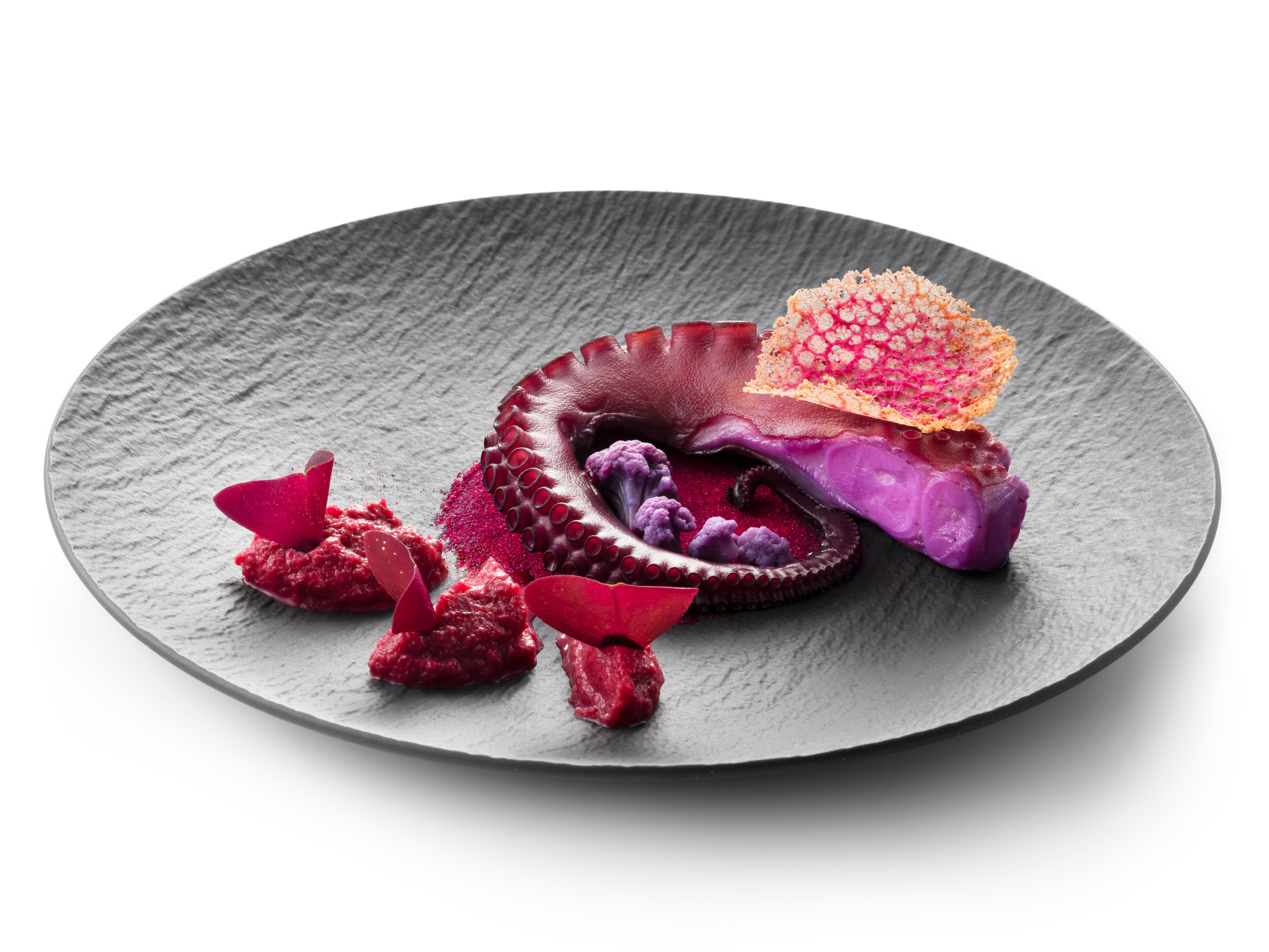
Purple: luxury, spirituality, royalty and antioxidants. Think violets, aubergines, grapes, red cabbage.
Blue: calm, peace, tranquillity, rarity and sophistication. Think blueberries, butterfly peas, flowers.
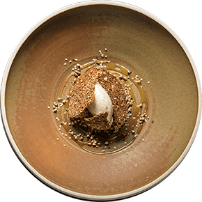
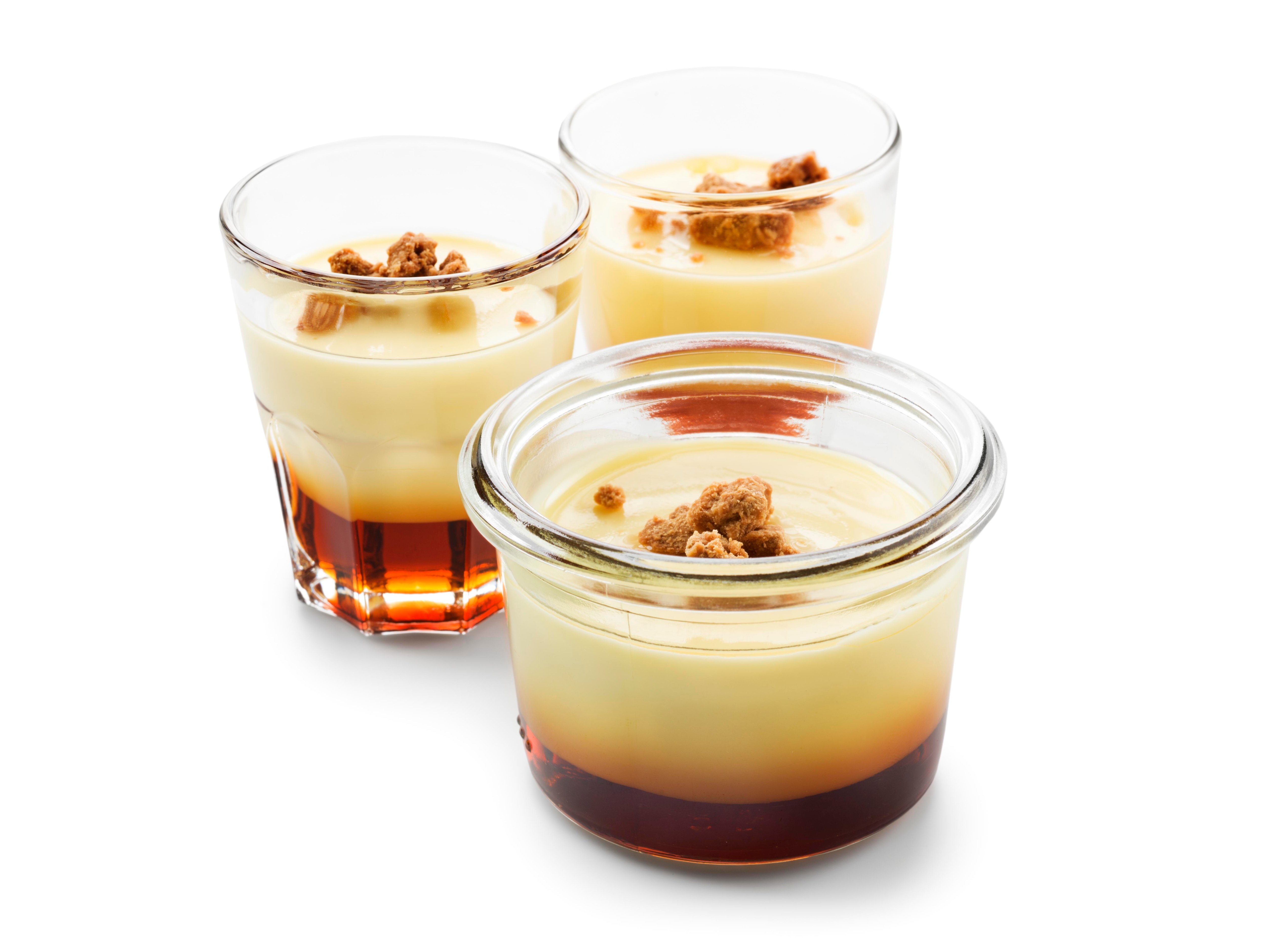
Brown: neutrality, confidence, earthiness, comfort and richness. Think chocolate, coffee, mushrooms.
Pink: playful, passionate, feminine and sweet. Think strawberry mousse, rhubarb, candyfloss.
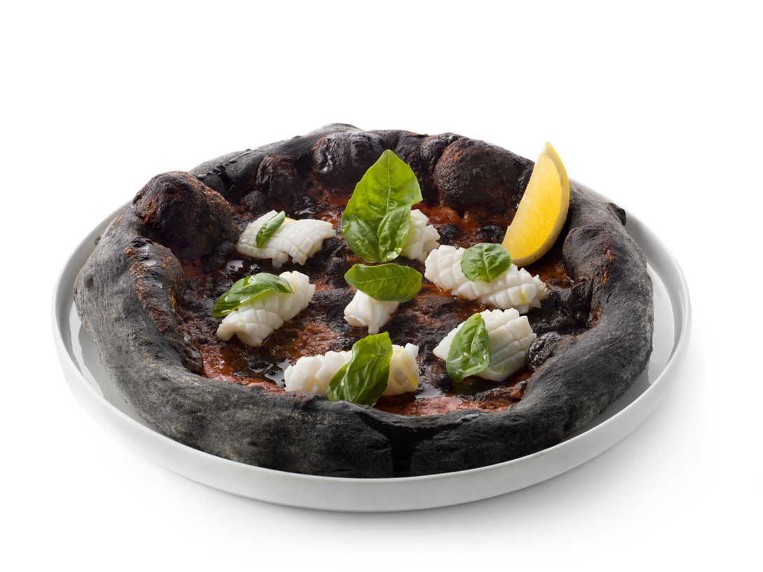
Black: death, mystery, status, power, elegance and umami flavours. Think truffles, black garlic, octopus ink, olives.
White: purity, cleanliness, simplicity, peace and neutrality. Think ingredients based on dairy products, rice, milk, coconut.
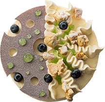
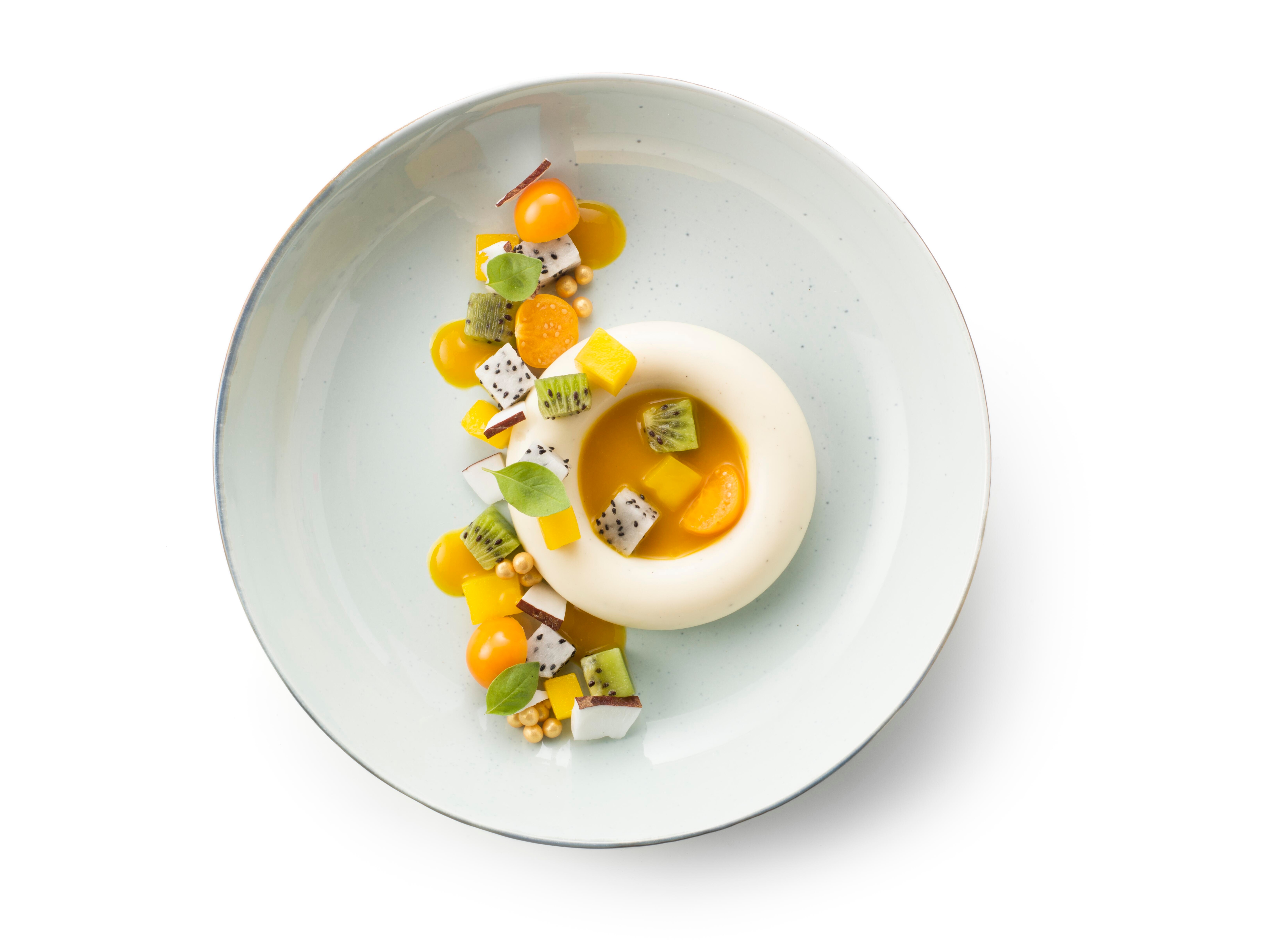
Joan and Jordi Roca of Spanish three-star restaurant El Celler de Can Roca introduced so-called chromotherapy. They work with a single colour as their inspiration. Their milk dessert is world-famous: it mainly revolves around one product group (dairy) and one colour (white). This may seem a bit boring at first. However, the surprise when eating it is all the greater, when many unexpected flavour and temperature contrasts appear.
Jordi Roca made a dessert in the same style called Cromologia verde 2003 of apple, mint, Chartreuse, eucalyptus and basil. Why not try a starter with only green ingredients, a dessert with warm, dark colours like coffee, caramel and chocolate or a dish with only the same colours like beetroot and cherries, or orange, carrot and passion fruit. The possibilities are endless. Think carefully about which colour will have the right effect on your guests. Should the course bring tranquillity or should it have an uplifting effect?
1. A light plate will bring the visual focus to your creation.
2. By letting a specific colour dominate a dish, you affect how it is perceived.
3. Let your garnish be part of the flavour composition.
Garnish
There is so much choice in herbs and cresses. Make sure your garnish is an important part of the flavour combination and therefore of the taste experience. You can deepen your flavours, or provide a complementary taste with it. These days more than enough techniques are available to add colour to a dish in a way that stands out. Think of crisps in all sorts of flavours and colours, dried fruit and vegetables or a bright green cream: they can light up your whole dish.

Dive Into Our Methods and Bring Culinary History Back to Life.
Discover now